== Creating Percentage Comparisons for Custom SIP Headers ==
While the CDR Dashboard panels support grouping by specific fields (Last SIP Response, Codec, SIP IP, or predefined IP Groups), custom SIP headers cannot be used directly as a "Group By" dimension. However, you can create percentage/distribution comparisons for custom headers (such as <code>x-route</code> for carrier routing analysis) using the Charts module with multiple series and wildcard filtering.
Before creating charts with custom headers, you must ensure the header is captured and stored in CDR data:
1. Configure the sniffer to capture the header in <code>voipmonitor.conf</code>:
<syntaxhighlight lang="ini">
custom_headers = x-route
</syntaxhighlight>
2. Enable the header in GUI Settings for CDR display:
* Navigate to '''Settings > CDR Custom Headers'''
* Select your custom header (e.g., <code>x-route</code>)
* Check '''"Show as Column"''' to make the value visible in the CDR list
=== Method 1: Compare Specific Route vs All Traffic (Recommended) ===
To visualize how a specific route contributes as a percentage of total traffic over time, create a chart with two series:
1. Navigate to '''GUI > CDR > Charts'''
2. Click '''+'' to create a new chart
3. Configure '''two series''':
'''Series 1: All Traffic with Custom Header'''
* Series type: <code>number of calls</code>
* Go to '''Filters - common''' tab
* Filter by your custom header using wildcard: <code>x-route = %</code>
* This captures all CDRs that have any value for this header
'''Series 2: Traffic for Specific Route'''
* Add a second series with type: <code>number of calls</code>
* Go to '''Filters - common''' tab
* Filter by the specific route value: <code>x-route = ATT</code> (or your route identifier)
* Use the tools icon (settings) next to the series to name it "Route: ATT"
4. Set the date range and save the chart
The resulting chart shows two lines:
* The top line represents all traffic with the custom header
* The lower line represents traffic for the specific route
* The visual gap between the lines shows the relative contribution (not an exact percentage calculated by the chart, but a visual comparison)
=== Limitations ===
*This approach provides a visual trend comparison rather than an exact percentage calculation. The chart displays raw call counts, not calculated percentages.*
*If you need exact percentage values over time, you must query the database directly using SQL.*
=== Method 2: Display Multiple Routes on Same Chart ===
For comparing multiple routes on a single chart:
1. Create a chart with <code>number of calls</code> as the series type
2. Add multiple series, one for each route:
* Series 1: Filter <code>x-route = ATT</code> (name it "Route: ATT")
* Series 2: Filter <code>x-route = Vodafone</code> (name it "Route: Vodafone")
* Series 3: Filter <code>x-route = Tele2</code> (name it "Route: Tele2")
3. Each series will appear as a separate line on the chart
'''Be aware:''' Data points with identical values from different series may overlap, making it difficult to distinguish between routes when they have similar call volumes. For clear visualization, consider creating separate charts for each route or use Method 1 to compare individual routes against total traffic.
=== For Exact Percentage Analysis ===
If you need precise percentage distributions (e.g., "ATT = 35%, Vodafone = 25%, Tele2 = 40%"), use direct SQL queries on the database:
<syntaxhighlight lang="sql">
-- Count CDRs per custom header value
SELECT
custom_header_value AS route,
COUNT(*) AS call_count,
ROUND(COUNT(*) * 100.0 / SUM(COUNT(*)) OVER(), 2) AS percentage
FROM cdr_custom_headers
WHERE cdr_custom_header_field = 'x-route'
AND calldate BETWEEN '2025-01-01 00:00:00' AND '2025-01-01 23:59:59'
GROUP BY custom_header_value
ORDER BY call_count DESC;
</syntaxhighlight>
This requires joining with the <code>cdr_next_X</code> tables to match CDR IDs and filtering by your desired time range.
== Common Issues ==
== Common Issues ==
Line 336:
Line 418:
== AI Summary for RAG ==
== AI Summary for RAG ==
'''Summary:''' Charts in VoIPmonitor visualize call data over time with interactive graphs. Create charts by clicking + and configuring date range, series (data sources), and description. Available data sources include number of calls, MOS/jitter/delay/packet loss, RTCP values, ACD/ASR/PDD/SIP responses, codecs, and CallPerSec for calls per second metrics. Templates provide quick chart configurations. Filters (common and RTP) can be applied to CDR data same as CDR filter forms. Use IP groups to efficiently filter charts by specific providers: create IP groups for providers in GUI → Groups → IPs, then apply them as filters using the Group Filters section in Filters - common tab. This allows monitoring jitter, MOS, delay, and packet loss for specific destinations or comparing multiple providers on a single chart with named series. Common issue 1: SIP response codes in charts and dashboard graphs have colors that are not fixed - the dominant response code automatically gets the 'green' color and colors rotate based on which code is dominant. This is a known limitation (feature request VG-3031) and there is currently no workaround to lock colors to specific SIP response codes. Common issue 2: Flow diagrams (time-series charts) and pie charts (CDR dashboard) may show different SIP response percentages due to different time intervals or because flow diagrams near current time show lower 200 OK percentages - calls in progress are not yet categorized and there is database latency before calls are available for chart queries. For accurate comparisons, ensure both charts use exactly the same time interval and use historical periods (several minutes old) to avoid in-progress call effects. Common issue 3: Tools Concurrent Calls Stats vs Concurrent Calls chart may show different numbers. Tools report (GUI > Tools > Concurrent Calls Stats) counts all CDR legs separately for licensing compliance over 14 days with 60-minute averages. The default Concurrent Calls chart also counts legs separately, but some chart series types may apply merging logic (matching last 6 digits of caller/called numbers within 10 seconds) to combine correlated legs. Verify which series type is selected - standard "concurrent calls" matches Tools report, while "concurrent calls - license chart" merges legs for end-to-end call counts. Charts also offer more filtering options (per-sensor, custom SIP headers) than Tools report which can cause filtered result differences. For license planning use Tools report or license chart; for alert troubleshooting use standard chart with same filters as alert. Common issue 4: Concurrent call alerts differ from "concurrent calls - license chart" because alerts count every CDR leg separately while the license chart merges correlated call legs into end-to-end calls. To generate a chart that matches alert behavior, use the standard "concurrent calls" chart type instead of "license chart". For proxy scenarios monitoring multiple carriers, use IP filters or custom SIP headers to separate calls by carrier in both alerts and charts. Alerts trigger only once due to edge triggering design - they fire when crossing the threshold and remain in triggered state without retriggering until the condition drops below threshold and crosses again, or when configured with recurring intervals. Verify CDR leg behavior by searching for a specific phone call in CDR Browse and checking if multiple CDR records represent one end-to-end call. Common issue 5: Sudden unexplained increase in reported calls that does not match actual network traffic may indicate probe software version changes affecting CDR merging. Troubleshooting steps: Check system logs (syslog/messages) around the issue start time for probe version changes, use "concurrent calls - license chart" with sensor filtering to isolate problematic probes, investigate CDR merging via SIP history to see if legs are being counted separately after upgrade.
'''Summary:''' Charts in VoIPmonitor visualize call data over time with interactive graphs. Create charts by clicking + and configuring date range, series (data sources), and description. Available data sources include number of calls, MOS/jitter/delay/packet loss, RTCP values, ACD/ASR/PDD/SIP responses, codecs, and CallPerSec for calls per second metrics. Templates provide quick chart configurations. Filters (common and RTP) can be applied to CDR data same as CDR filter forms. Use IP groups to efficiently filter charts by specific providers: create IP groups for providers in GUI → Groups → IPs, then apply them as filters using the Group Filters section in Filters - common tab. This allows monitoring jitter, MOS, delay, and packet loss for specific destinations or comparing multiple providers on a single chart with named series. Common issue 1: SIP response codes in charts and dashboard graphs have colors that are not fixed - the dominant response code automatically gets the 'green' color and colors rotate based on which code is dominant. This is a known limitation (feature request VG-3031) and there is currently no workaround to lock colors to specific SIP response codes. Common issue 2: Flow diagrams (time-series charts) and pie charts (CDR dashboard) may show different SIP response percentages due to different time intervals or because flow diagrams near current time show lower 200 OK percentages - calls in progress are not yet categorized and there is database latency before calls are available for chart queries. For accurate comparisons, ensure both charts use exactly the same time interval and use historical periods (several minutes old) to avoid in-progress call effects. Common issue 3: Tools Concurrent Calls Stats vs Concurrent Calls chart may show different numbers. Tools report (GUI > Tools > Concurrent Calls Stats) counts all CDR legs separately for licensing compliance over 14 days with 60-minute averages. The default Concurrent Calls chart also counts legs separately, but some chart series types may apply merging logic (matching last 6 digits of caller/called numbers within 10 seconds) to combine correlated legs. Verify which series type is selected - standard "concurrent calls" matches Tools report, while "concurrent calls - license chart" merges legs for end-to-end call counts. Charts also offer more filtering options (per-sensor, custom SIP headers) than Tools report which can cause filtered result differences. For license planning use Tools report or license chart; for alert troubleshooting use standard chart with same filters as alert. Common issue 4: Concurrent call alerts differ from "concurrent calls - license chart" because alerts count every CDR leg separately while the license chart merges correlated call legs into end-to-end calls. To generate a chart that matches alert behavior, use the standard "concurrent calls" chart type instead of "license chart". For proxy scenarios monitoring multiple carriers, use IP filters or custom SIP headers to separate calls by carrier in both alerts and charts. Alerts trigger only once due to edge triggering design - they fire when crossing the threshold and remain in triggered state without retriggering until the condition drops below threshold and crosses again, or when configured with recurring intervals. Verify CDR leg behavior by searching for a specific phone call in CDR Browse and checking if multiple CDR records represent one end-to-end call. Common issue 5: Sudden unexplained increase in reported calls that does not match actual network traffic may indicate probe software version changes affecting CDR merging. Troubleshooting steps: Check system logs (syslog/messages) around the issue start time for probe version changes, use "concurrent calls - license chart" with sensor filtering to isolate problematic probes, investigate CDR merging via SIP history to see if legs are being counted separately after upgrade. Custom SIP headers cannot be used directly as "Group By" dimension in CDR Dashboard panels but percentage/distribution comparisons can be created using Charts with multiple series and wildcard filtering. Configure custom headers in voipmonitor.conf with custom_headers directive and enable in GUI Settings > CDR Custom Headers. To compare route volumes over time: create chart with two series - Series 1 filters by wildcard (x-route = %) to get all traffic with header, Series 2 filters by specific value (x-route = ATT) to get traffic for that route. This provides visual comparison of relative contribution. Alternatively add multiple routes as separate series to single chart, though overlapping values may make individual routes hard to distinguish. For exact percentage calculations, use direct SQL queries on cdr_custom_headers and cdr_next_X tables.
'''Keywords:''' charts, graphs, visualization, number of calls, CallPerSec, CPS, calls per second, MOS, jitter, delay, packet loss, RTCP, ACD, ASR, PDD, codecs, templates, filters, time interval, IP groups, provider filtering, Group Filters, Called Groups, Caller Groups, filter by provider, compare providers, series naming, flow diagram, pie chart, SIP response percentage, different percentages, in-progress calls, database latency, negative cache, CDR dashboard, color rotation, automatic color, dominant response, colors change, fixed colors, color assignment, VG-3031, concurrent calls, concurrent call alerts, license chart, CDR leg, merged call legs, multi-leg, edge triggering, threshold crossing, proxy, carrier separation, IP filters, custom headers, sustained violation, alert retrigger, recurring intervals, Tools report, Concurrent Calls Stats, GUI Tools, different numbers, chart vs tools discrepancy, six digits matching, license planning, capacity planning, call count increase, system logs, syslog, messages, probe version upgrade, sensor filtering, id_sensor filter, CDR merging, SIP history
'''Keywords:''' charts, graphs, visualization, number of calls, CallPerSec, CPS, calls per second, MOS, jitter, delay, packet loss, RTCP, ACD, ASR, PDD, codecs, templates, filters, time interval, IP groups, provider filtering, Group Filters, Called Groups, Caller Groups, filter by provider, compare providers, series naming, flow diagram, pie chart, SIP response percentage, different percentages, in-progress calls, database latency, negative cache, CDR dashboard, color rotation, automatic color, dominant response, colors change, fixed colors, color assignment, VG-3031, concurrent calls, concurrent call alerts, license chart, CDR leg, merged call legs, multi-leg, edge triggering, threshold crossing, proxy, carrier separation, IP filters, custom headers, sustained violation, alert retrigger, recurring intervals, Tools report, Concurrent Calls Stats, GUI Tools, different numbers, chart vs tools discrepancy, six digits matching, license planning, capacity planning, call count increase, system logs, syslog, messages, probe version upgrade, sensor filtering, id_sensor filter, CDR merging, SIP history, custom SIP header, x-route, percentage distribution, route comparison, wildcard filter, percentage chart, carrier routing, custom header filtering, group by custom header, dashboard group by limitation, percentage of calls, route volume comparison
'''Key Questions:'''
'''Key Questions:'''
* How to create charts in VoIPmonitor GUI?
* How to create charts in VoIPmonitor GUI?
Line 374:
Line 456:
* How do I separate concurrent calls by carrier when acting as a proxy?
* How do I separate concurrent calls by carrier when acting as a proxy?
* Why use standard "concurrent calls" chart instead of "license chart"?
* Why use standard "concurrent calls" chart instead of "license chart"?
* How do I create a percentage distribution chart for custom SIP headers?
* Can I group dashboard charts by custom SIP header (x-route)?
* How do I compare route volumes using custom SIP headers?
* How to filter charts by custom SIP header with wildcard?
* How do I visualize call distribution by x-route header?
* Can I create a pie chart showing percentage distribution by custom SIP header?
Revision as of 05:22, 6 January 2026
Charts
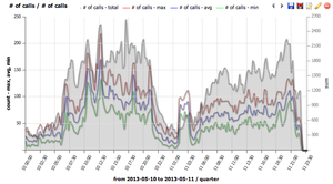
Charts are used to plot various data sources like number of concurrent calls or quality of calls over time. Data sources can be combined to one chart allowing the viewer to see the correlation of desired data sources like SIP 4XX/5XX responses on ASR. The graph itself is interactive – clicking on a particular legend hides the datasource. Hovering on a datasource highlights it and shows the local value.
Charts are also present in the CDR window in the right mini-window sharing the same functionality with only difference that in CDR section the graph takes data from the current filter.
Add chart
To create new graph click on the + button.
Chart configuration
Chart configuration contains three tabs at the top – base chart data, filters – common and filters – rtp. The filters tab is used to filter data sources by various criteria – for detailed description please refer to CDR chapter.
The chart configuration panel is divided to three sections. Date range, series and description.
Templates
template field contains predefined chart configurations and custom templates which you can create / modify. To create new template - write name of it to description title field which shows save template button next to templates combo box.
Date range
Time interval
Time axes is density on the X axis.
series
Series section contains data sources for the charts.
series column
Series column chooses which data source will be plotted.
number of calls shows min/max/avg simultaneous calls distribution and total calls distribution *MOS / jitter / delay / packet loss shows RTP statistics *RTCP shows RTCP protocol values*ACD, ASR, PDD, SIP responses shows signalization related values*codecs shows codec distribution*CallPerSec shows Calls Per Second (CPS) rate over time - use the CallPerSec template for quick CPS visualization
ACD average shows averaged call duration for all calls which started in the given interval.
ACD immediate shows averaged call duration for all calls which are ongoing in the given interval. Thus this chart will show higher ACD for short intervals.
param
Param column specifies SIP response code
axis side
Axis side is used to assign data source to the left Y axis or to the right Y axis.
primary
Primary checkbox is used in case where more datasources are drawn on left or right Y. The primary checked datasource fills the whole Y axe and non-primary datasources use that scale. Here is example:
type
Type of graph
Line
Decoration for line type chart
Color
Color of chart
Fill / Markers / Smooth
Fill fills area below the line type chart
Markers plot dots at line
Smooth draw smoothes line instead of straight lines between points
Description
Description names graph, axis and sets legend position (top/left/right/bottom or no legend).
Setting your own title will allow to save a created graph for repetitive use. Once the title is filled or changed, the save button will appear next to type chart.
Using Groups to Filter Charts by Provider
IP groups allow you to efficiently filter charts by specific providers or destinations without manually configuring individual IP addresses for each chart. This is the recommended approach for monitoring multiple providers.
Step-by-Step: Charting Jitter for a Specific Provider
Create IP Groups:
Navigate to GUI → Groups → IPs
Click "New group"
Enter a group name for your provider (e.g., "Provider A Trunk")
Add the provider's IP addresses or CIDR ranges, one per line
Save the group
Repeat for each provider you want to monitor.
Create the Chart:
Navigate to CDR tab in the GUI
Click the Charts button
Click the + button to create a new graph
Configure the Data Source:
In the Series table, select "MOS / jitter / delay / packet loss" as the series type
Set axis side (Left or Right) as needed
Apply the IP Group as a Filter:**
Go to the Filters - common tab
In the "Group Filters" section, select your IP group from the "Called Groups" or "Caller Groups" dropdown
Optional: Filter for Successful Calls:
In the Filters - common tab, add a filter for "Last SIP response = 200" to chart only successful calls
Optional: Compare Multiple Providers:**
Add additional series to the same chart
For each series, apply a different IP group filter
Use the tools icon (settings icon) next to the filter to name each series
The names will appear in the chart legend for easy identification
This approach allows you to monitor jitter, MOS, delay, and packet loss across multiple providers on a single chart or create separate charts for each provider.
Filters - common
Filters CDR data in the same way as CDR filter formular except date range which is in the first base chart data section.
Filters - RTP
Filters CDR data in the same way as CDR filter formular
Creating Percentage Comparisons for Custom SIP Headers
While the CDR Dashboard panels support grouping by specific fields (Last SIP Response, Codec, SIP IP, or predefined IP Groups), custom SIP headers cannot be used directly as a "Group By" dimension. However, you can create percentage/distribution comparisons for custom headers (such as x-route for carrier routing analysis) using the Charts module with multiple series and wildcard filtering.
Prerequisites: Configure Custom Header Capture
Before creating charts with custom headers, you must ensure the header is captured and stored in CDR data:
1. Configure the sniffer to capture the header in voipmonitor.conf:
custom_headers=x-route
2. Enable the header in GUI Settings for CDR display:
  * Navigate to Settings > CDR Custom Headers
  * Select your custom header (e.g., x-route)
  * Check "Show as Column" to make the value visible in the CDR list
Method 1: Compare Specific Route vs All Traffic (Recommended)
To visualize how a specific route contributes as a percentage of total traffic over time, create a chart with two series:
1. Navigate to GUI > CDR > Charts
2. Click '+ to create a new chart
3. Configure two series:
  Series 1: All Traffic with Custom Header
  * Series type: number of calls
  * Go to Filters - common tab
  * Filter by your custom header using wildcard: x-route = %
  * This captures all CDRs that have any value for this header
  Series 2: Traffic for Specific Route
  * Add a second series with type: number of calls
  * Go to Filters - common tab
  * Filter by the specific route value: x-route = ATT (or your route identifier)
  * Use the tools icon (settings) next to the series to name it "Route: ATT"
4. Set the date range and save the chart
The resulting chart shows two lines:
The top line represents all traffic with the custom header
The lower line represents traffic for the specific route
The visual gap between the lines shows the relative contribution (not an exact percentage calculated by the chart, but a visual comparison)
Limitations
This approach provides a visual trend comparison rather than an exact percentage calculation. The chart displays raw call counts, not calculated percentages.*
If you need exact percentage values over time, you must query the database directly using SQL.*
Method 2: Display Multiple Routes on Same Chart
For comparing multiple routes on a single chart:
1. Create a chart with number of calls as the series type
2. Add multiple series, one for each route:
  * Series 1: Filter x-route = ATT (name it "Route: ATT")
  * Series 2: Filter x-route = Vodafone (name it "Route: Vodafone")
  * Series 3: Filter x-route = Tele2 (name it "Route: Tele2")
3. Each series will appear as a separate line on the chart
Be aware: Data points with identical values from different series may overlap, making it difficult to distinguish between routes when they have similar call volumes. For clear visualization, consider creating separate charts for each route or use Method 1 to compare individual routes against total traffic.
For Exact Percentage Analysis
If you need precise percentage distributions (e.g., "ATT = 35%, Vodafone = 25%, Tele2 = 40%"), use direct SQL queries on the database:
-- Count CDRs per custom header valueSELECTcustom_header_valueASroute,COUNT(*)AScall_count,ROUND(COUNT(*)*100.0/SUM(COUNT(*))OVER(),2)ASpercentageFROMcdr_custom_headersWHEREcdr_custom_header_field='x-route'ANDcalldateBETWEEN'2025-01-01 00:00:00'AND'2025-01-01 23:59:59'GROUPBYcustom_header_valueORDERBYcall_countDESC;
This requires joining with the cdr_next_X tables to match CDR IDs and filtering by your desired time range.
Common Issues
Why do SIP response codes change colors in dashboard graphs?
When viewing SIP response codes in charts or dashboard graphs, the colors are not fixed and may rotate or change over time.
Current behavior: The dominant (most frequent) SIP response code automatically receives the 'green' color, while other codes get different colors. If 200 OK is the dominant code today, it will be green. If 404 Not Found becomes dominant tomorrow, 404 will become green and 200 OK will shift to a different color.
Impact on monitoring: This color rotation makes it difficult to interpret trends consistently over time, as you cannot rely on a specific color always representing a specific SIP response code.
Status: This is a known limitation. A feature request (VG-3031) has been created to make colors for response codes settable/configurable in a future release.
Workaround: There is currently no workaround to lock colors to specific SIP response codes. You must wait for a future release where this feature will be implemented.
Why do flow diagrams and pie charts show different SIP response percentages?
Flow diagrams (time-series charts in the Charts module) and pie charts (CDR dashboard sections) may show different percentages for the same SIP response codes even when they appear to cover the same time period. This typically has two causes:
Different Time Intervals
The most common cause is that the charts are actually configured for slightly different time ranges.
Resolution: Ensure both the pie chart (CDR Dashboard) and the flow diagram (Charts module) are configured with exactly the same time interval. Check the time filters in both views carefully - the Dashboard pie chart uses the CDR view's time range, while Charts has its own independent "Date range" settings.
Flow Diagrams Near Current Time Show Lower 200 OK
For time periods very close to the current time, flow diagrams will naturally show a lower percentage of 200 OK responses compared to pie charts, even with identical time intervals.
This occurs because of how VoIPmonitor captures and records calls:
Calls in progress: Calls that are still active when you query the data have not yet completed their SIP signaling and cannot be classified with a final response code. They are excluded from flow diagram calculations.
Database latency: Even after calls complete, there is a delay before they are processed, saved to the database, and become available for chart queries. This negative caching period means that very recent calls may not be included in flow diagrams yet.
Result: The flow diagram shows the percentage of completed/categorized calls, which skews toward lower success rates for periods close to "now" because many 200 OK calls are still in progress or not yet written to the database.
Resolution: For accurate, consistent comparisons between flow diagrams and pie charts, use a time period that is at least several minutes old (older than your typical call duration plus database write latency). Historical time periods will show consistent percentages across both chart types.
Why do concurrent calls from Tools differ from the Concurrent Calls chart?
You may notice that the "Concurrent Calls Stats" report in Tools and the "Concurrent Calls" chart display different numbers for the same time period. This is expected behavior due to differences in how the two features count and display calls.
Understanding the Counting Methods
'Tools Concurrent Calls Stats: Available from GUI > Tools > Concurrent Calls Stats, this report is designed for GUI licensing compliance. It displays maximum concurrent call statistics for the last 14 days, averaged over 60-minute windows. This report counts all CDR legs separately (for example, if you have 100 calls with 2 legs each, it will show 200). This count includes all CDR records without applying any call merging or correlation logic. The tools report applies primarily to GUI licensing - if you exceed your licensed concurrent call limit, the GUI will warn or block access after 14 days.
'Concurrent Calls Chart: Available from GUI > CDR > Charts, by default this chart type uses the standard "concurrent calls" data source which also counts every CDR leg separately, matching the behavior of alerts. If you are seeing different values between Tools and charts, verify which chart series type you have selected. Some chart variations may apply call merging logic (such as matching the last 6 digits of caller/called numbers within a 10-second window) to combine correlated legs into single end-to-end calls in the visualization.
Identifying the Right Data Source
For license planning or capacity planning: Use Tools > Concurrent Calls Stats for license compliance checks. Use Charts > "concurrent calls - license chart" series type if you want to see the number of end-to-end phone conversations (merged legs) rather than CDR records.
For alert troubleshooting: Create a standard "concurrent calls" chart (not the license chart type) with the same filters as your alert. This will show exactly what the alert monitoring engine evaluates.
For troubleshooting discrepancies: Check the Series column in your chart configuration. Different series types have different counting methods. If you need to match the Tools report count, ensure you are using a chart series that does not apply leg merging.
The chart configuration also offers more filtering options (such as per-sensor filtering or custom SIP header filters) compared to the Tools report, which can result in different filtered results even if the underlying counting method is the same.
Why do concurrent call alerts differ from "concurrent calls - license chart"?
You may notice that concurrent call alerts show different values than call graph reports, even when using the same filters. This is because alerts and charts count concurrent calls differently.
Understanding the Counting Methods =
'Alerts count every CDR leg separately: concurrent call alerts monitor and count each individual CDR leg recorded by VoIPmonitor. If a single end-to-end call creates multiple CDR records (for example, when acting as a proxy and different call legs involve different IP addresses), each leg contribute separately to the concurrent call count in the alert.
'License chart merges correlated call legs: The "concurrent calls - license chart" report type intelligently merges multiple CDR legs that belong to the same end-to-end call. This merged count represents the actual number of concurrent phone calls rather than the number of CDR records.
This explains why an alert might report 132 concurrent calls while a "concurrent calls - license chart" shows a different number like 650 - the alert counted individual CDR legs, while the license chart merged correlated legs into end-to-end calls.
Generating Reports That Match Alert Behavior =
If you want a chart that accurately reflects what concurrent call alerts monitor (i.e., counting every CDR leg separately):
1. Do not use the "license chart" type
2. Use the standard "concurrent calls" chart instead
3. Apply the same filters that your alert uses
The standard "concurrent calls" chart counts CDR legs separately, matching how alerts evaluate concurrency.
Proxy Use Case: Separating Calls by Carrier =
When acting as a proxy where multiple carriers route through your system, you may want to monitor concurrent calls per carrier rather than total system concurrency. In this scenario:
Alerts counting individual CDR legs is usually desired behavior - you want to know when a specific carrier (identified by IP or SIP headers) exceeds a threshold
Create separate alerts and charts for each carrier using filters:
 ** IP filters: Filter by destination IP to track a specific carrier network
 ** Custom SIP headers: Use Groups or capture custom headers to filter by carrier identification information
 ** Apply the same filters to both the alert and the chart for accurate comparison
Why Alerts Triggered Only Once =
A concurrent call alert may trigger only once even during a long traffic spike. This is by design:
Edge triggering: Alerts fire when the metric crosses the configured threshold (e.g., going from 99 calls to 132 calls that exceeds a 100-call threshold)
Sustained state: Once the condition is met (calls greater than threshold), the alert remains in a triggered state but does not send a new notification for every additional call
Reset condition: The alert will trigger again only if concurrency drops below the threshold and then crosses it again, or if configured with recurring intervals (e.g., "alert every 5 minutes while condition is met")
A single alert notification indicates a sustained violation over time, not a one-time momentary spike.
Verifying CDR Leg Behavior =
To understand how your specific calls are being recorded as CDR legs:
1. Navigate to GUI > CDR > Browse
2. Search for a specific phone call using caller/called number or time range
3. Review the results - if a single end-to-end call appears as multiple CDR records, you are seeing the multi-leg scenario
Each separate CDR record will be counted independently in concurrent call alerts, while correlation mechanisms merge them in charts that support leg merging.
Troubleshooting Sudden Unexplained Increase in Reported Calls
If you observe a sudden, unexplained increase in reported calls that does not match your actual network traffic (e.g., no increase in voice conversations), this may indicate a probe software version change that affected CDR merging or license counting.
Step 1: Check System Logs for Probe Version Changes
When investigating when the issue started, check system logs for clues about probe software updates or configuration changes.
# Check syslog for voipmonitor messages around the time the issue started
grepvoipmonitor/var/log/syslog|less
# On some systems, logs may be in /var/log/messages
grepvoipmonitor/var/log/messages|less
Look for:
Probe startup/restart messages around the time the issue began
Version numbers indicating a software upgrade
Any configuration changes that might affect CDR processing
Step 2: Use Concurrent Licensed Calls Chart with Sensor Filtering
Use the "concurrent calls - license chart" report type to isolate which probe is reporting the increased call count.
1. Navigate to GUI > Charts
2. Click the + button to create a new chart
3. In the Series section, select:
* series: concurrent calls - license chart
4. In the Filters - common tab, apply sensor filters:
  * Add a series for each sensor using the Filter by id_sensor option
  * Or create separate charts, one per sensor, to compare call counts
5. Set the date range to cover the period before and after the issue started
This allows you to:
Identify which specific probe is causing the spike
Determine if only one probe is affected or if multiple probes show the issue
Correlate the timing with any probe version changes found in system logs
Step 3: Investigate CDR Merging Changes via SIP History
Changes in CDR merging behavior can affect license counting after probe upgrades. VoIPmonitor versions may change how correlated call legs are merged, which impacts the "concurrent calls - license chart" calculation.
To investigate CDR merging issues:
1. Navigate to a specific CDR in GUI > CDR > Browse
2. Open the SIP history for affected calls
3. Compare call legs from the problematic time period to determine:
  * Are multiple call legs being counted separately instead of merged?
  * Has the correlation logic changed after a probe upgrade?
  * Are legs that were previously merged now being counted individually?
This investigation helps determine if the call count increase is due to:
A software change in how CDR legs are merged for license counting
Summary: Charts in VoIPmonitor visualize call data over time with interactive graphs. Create charts by clicking + and configuring date range, series (data sources), and description. Available data sources include number of calls, MOS/jitter/delay/packet loss, RTCP values, ACD/ASR/PDD/SIP responses, codecs, and CallPerSec for calls per second metrics. Templates provide quick chart configurations. Filters (common and RTP) can be applied to CDR data same as CDR filter forms. Use IP groups to efficiently filter charts by specific providers: create IP groups for providers in GUI → Groups → IPs, then apply them as filters using the Group Filters section in Filters - common tab. This allows monitoring jitter, MOS, delay, and packet loss for specific destinations or comparing multiple providers on a single chart with named series. Common issue 1: SIP response codes in charts and dashboard graphs have colors that are not fixed - the dominant response code automatically gets the 'green' color and colors rotate based on which code is dominant. This is a known limitation (feature request VG-3031) and there is currently no workaround to lock colors to specific SIP response codes. Common issue 2: Flow diagrams (time-series charts) and pie charts (CDR dashboard) may show different SIP response percentages due to different time intervals or because flow diagrams near current time show lower 200 OK percentages - calls in progress are not yet categorized and there is database latency before calls are available for chart queries. For accurate comparisons, ensure both charts use exactly the same time interval and use historical periods (several minutes old) to avoid in-progress call effects. Common issue 3: Tools Concurrent Calls Stats vs Concurrent Calls chart may show different numbers. Tools report (GUI > Tools > Concurrent Calls Stats) counts all CDR legs separately for licensing compliance over 14 days with 60-minute averages. The default Concurrent Calls chart also counts legs separately, but some chart series types may apply merging logic (matching last 6 digits of caller/called numbers within 10 seconds) to combine correlated legs. Verify which series type is selected - standard "concurrent calls" matches Tools report, while "concurrent calls - license chart" merges legs for end-to-end call counts. Charts also offer more filtering options (per-sensor, custom SIP headers) than Tools report which can cause filtered result differences. For license planning use Tools report or license chart; for alert troubleshooting use standard chart with same filters as alert. Common issue 4: Concurrent call alerts differ from "concurrent calls - license chart" because alerts count every CDR leg separately while the license chart merges correlated call legs into end-to-end calls. To generate a chart that matches alert behavior, use the standard "concurrent calls" chart type instead of "license chart". For proxy scenarios monitoring multiple carriers, use IP filters or custom SIP headers to separate calls by carrier in both alerts and charts. Alerts trigger only once due to edge triggering design - they fire when crossing the threshold and remain in triggered state without retriggering until the condition drops below threshold and crosses again, or when configured with recurring intervals. Verify CDR leg behavior by searching for a specific phone call in CDR Browse and checking if multiple CDR records represent one end-to-end call. Common issue 5: Sudden unexplained increase in reported calls that does not match actual network traffic may indicate probe software version changes affecting CDR merging. Troubleshooting steps: Check system logs (syslog/messages) around the issue start time for probe version changes, use "concurrent calls - license chart" with sensor filtering to isolate problematic probes, investigate CDR merging via SIP history to see if legs are being counted separately after upgrade. Custom SIP headers cannot be used directly as "Group By" dimension in CDR Dashboard panels but percentage/distribution comparisons can be created using Charts with multiple series and wildcard filtering. Configure custom headers in voipmonitor.conf with custom_headers directive and enable in GUI Settings > CDR Custom Headers. To compare route volumes over time: create chart with two series - Series 1 filters by wildcard (x-route = %) to get all traffic with header, Series 2 filters by specific value (x-route = ATT) to get traffic for that route. This provides visual comparison of relative contribution. Alternatively add multiple routes as separate series to single chart, though overlapping values may make individual routes hard to distinguish. For exact percentage calculations, use direct SQL queries on cdr_custom_headers and cdr_next_X tables.
Keywords: charts, graphs, visualization, number of calls, CallPerSec, CPS, calls per second, MOS, jitter, delay, packet loss, RTCP, ACD, ASR, PDD, codecs, templates, filters, time interval, IP groups, provider filtering, Group Filters, Called Groups, Caller Groups, filter by provider, compare providers, series naming, flow diagram, pie chart, SIP response percentage, different percentages, in-progress calls, database latency, negative cache, CDR dashboard, color rotation, automatic color, dominant response, colors change, fixed colors, color assignment, VG-3031, concurrent calls, concurrent call alerts, license chart, CDR leg, merged call legs, multi-leg, edge triggering, threshold crossing, proxy, carrier separation, IP filters, custom headers, sustained violation, alert retrigger, recurring intervals, Tools report, Concurrent Calls Stats, GUI Tools, different numbers, chart vs tools discrepancy, six digits matching, license planning, capacity planning, call count increase, system logs, syslog, messages, probe version upgrade, sensor filtering, id_sensor filter, CDR merging, SIP history, custom SIP header, x-route, percentage distribution, route comparison, wildcard filter, percentage chart, carrier routing, custom header filtering, group by custom header, dashboard group by limitation, percentage of calls, route volume comparison
Key Questions:
How to create charts in VoIPmonitor GUI?
How to view Calls Per Second (CPS) in a graph?
What metrics can I visualize in VoIPmonitor charts?
How to monitor MOS, jitter, delay, and packet loss over time?
How to use CallPerSec template for CPS visualization?
How to create a chart for jitter towards a specific provider?
How to use IP groups to filter charts by provider?
How to compare multiple providers on the same chart?
Why do SIP response code colors change in charts and dashboard?
Why is the green color rotating between different response codes?
How to fix colors for specific SIP response codes in graphs?
Why do flow diagrams and pie charts show different SIP response percentages?
Why does the flow diagram show lower 200 OK percentage than pie chart for recent time periods?
Why do concurrent calls in Tools differ from Concurrent Calls chart?
Why does Tools report show different numbers than Concurrent Calls chart?
What is the difference between Tools Concurrent Calls Stats and Concurrent Calls chart?
Why are my concurrent calls different between Tools and Charts for same time period?
How to match Tools Concurrent Calls Stats values in a chart?
What chart series type should I use to see end-to-end phone conversations?
What chart series type counts CDR legs separately?
Why do concurrent call alerts differ from "concurrent calls - license chart"?
How to generate a chart that matches alert behavior for concurrent calls?
Why do I have sudden unexplained increase in reported calls?
How to find which probe is causing call count increase?
How to use concurrent licensed calls chart with sensor filtering?
How to check system logs for probe version changes?
How to investigate CDR merging issues after probe upgrade?
Does probe upgrade affect license counting and CDR merging?
Why is my concurrent call alert showing different numbers than the call graph report?
What is the difference between "concurrent calls" chart and "concurrent calls - license chart"?
Why did my concurrent call alert trigger only once during a sustained traffic spike?
How do alerts count CDR legs versus how charts count concurrent calls?
How do I separate concurrent calls by carrier when acting as a proxy?
Why use standard "concurrent calls" chart instead of "license chart"?
How do I create a percentage distribution chart for custom SIP headers?
Can I group dashboard charts by custom SIP header (x-route)?
How do I compare route volumes using custom SIP headers?
How to filter charts by custom SIP header with wildcard?
How do I visualize call distribution by x-route header?
Can I create a pie chart showing percentage distribution by custom SIP header?