Charts are used to plot various data sources like number of concurrent calls or quality of calls over time. Data sources can be combined to one chart allowing the viewer to see the correlation of desired data sources like SIP 4XX/5XX responses on ASR. The graph itself is interactive – clicking on a particular legend hides the datasource. Hovering on a datasource highlights it and shows the local value.
Charts are also present in the CDR window in the right mini-window sharing the same functionality with only difference that in CDR section the graph takes data from the current filter.
Add chart
To create new graph click on the + button.
Chart configuration
Chart configuration contains three tabs at the top – base chart data, filters – common and filters – rtp. The filters tab is used to filter data sources by various criteria – for detailed description please refer to CDR chapter.
The chart configuration panel is divided to three sections. Date range, series and description.
Templates
template field contains predefined chart configurations and custom templates which you can create / modify. To create new template - write name of it to description title field which shows save template button next to templates combo box.
Date range
Time interval
Time axes is density on the X axis.
series
Series section contains data sources for the charts.
series column
Series column chooses which data source will be plotted.
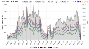
number of calls shows min/max/avg simultaneous calls distribution and total calls distribution *MOS / jitter / delay / packet loss shows RTP statistics *RTCP shows RTCP protocol values*ACD, ASR, PDD, SIP responses shows signalization related values*codecs shows codec distribution*CallPerSec shows Calls Per Second (CPS) rate over time - use the CallPerSec template for quick CPS visualization
ACD average shows averaged call duration for all calls which started in the given interval.
ACD immediate shows averaged call duration for all calls which are ongoing in the given interval. Thus this chart will show higher ACD for short intervals.
param
Param column specifies SIP response code
axis side
Axis side is used to assign data source to the left Y axis or to the right Y axis.
primary
Primary checkbox is used in case where more datasources are drawn on left or right Y. The primary checked datasource fills the whole Y axe and non-primary datasources use that scale. Here is example:
type
Type of graph
Line
Decoration for line type chart
Color
Color of chart
Fill / Markers / Smooth
Fill fills area below the line type chart
Markers plot dots at line
Smooth draw smoothes line instead of straight lines between points
Description
Description names graph, axis and sets legend position (top/left/right/bottom or no legend).
Setting your own title will allow to save a created graph for repetitive use. Once the title is filled or changed, the save button will appear next to type chart.
Using Groups to Filter Charts by Provider
IP groups allow you to efficiently filter charts by specific providers or destinations without manually configuring individual IP addresses for each chart. This is the recommended approach for monitoring multiple providers.
Step-by-Step: Charting Jitter for a Specific Provider
Create IP Groups:
Navigate to GUI → Groups → IPs
Click "New group"
Enter a group name for your provider (e.g., "Provider A Trunk")
Add the provider's IP addresses or CIDR ranges, one per line
Save the group
Repeat for each provider you want to monitor.
Create the Chart:
Navigate to CDR tab in the GUI
Click the Charts button
Click the + button to create a new graph
Configure the Data Source:
In the Series table, select "MOS / jitter / delay / packet loss" as the series type
Set axis side (Left or Right) as needed
Apply the IP Group as a Filter:**
Go to the Filters - common tab
In the "Group Filters" section, select your IP group from the "Called Groups" or "Caller Groups" dropdown
Optional: Filter for Successful Calls:
In the Filters - common tab, add a filter for "Last SIP response = 200" to chart only successful calls
Optional: Compare Multiple Providers:**
Add additional series to the same chart
For each series, apply a different IP group filter
Use the tools icon (settings icon) next to the filter to name each series
The names will appear in the chart legend for easy identification
This approach allows you to monitor jitter, MOS, delay, and packet loss across multiple providers on a single chart or create separate charts for each provider.
Filters - common
Filters CDR data in the same way as CDR filter formular except date range which is in the first base chart data section.
Filters - RTP
Filters CDR data in the same way as CDR filter formular
Common Issues
Why do flow diagrams and pie charts show different SIP response percentages?
Flow diagrams (time-series charts in the Charts module) and pie charts (CDR dashboard sections) may show different percentages for the same SIP response codes even when they appear to cover the same time period. This typically has two causes:
Different Time Intervals
The most common cause is that the charts are actually configured for slightly different time ranges.
Resolution: Ensure both the pie chart (CDR Dashboard) and the flow diagram (Charts module) are configured with exactly the same time interval. Check the time filters in both views carefully - the Dashboard pie chart uses the CDR view's time range, while Charts has its own independent "Date range" settings.
Flow Diagrams Near Current Time Show Lower 200 OK
For time periods very close to the current time, flow diagrams will naturally show a lower percentage of 200 OK responses compared to pie charts, even with identical time intervals.
This occurs because of how VoIPmonitor captures and records calls:
Calls in progress: Calls that are still active when you query the data have not yet completed their SIP signaling and cannot be classified with a final response code. They are excluded from flow diagram calculations.
Database latency: Even after calls complete, there is a delay before they are processed, saved to the database, and become available for chart queries. This negative caching period means that very recent calls may not be included in flow diagrams yet.
Result: The flow diagram shows the percentage of completed/categorized calls, which skews toward lower success rates for periods close to "now" because many 200 OK calls are still in progress or not yet written to the database.
Resolution: For accurate, consistent comparisons between flow diagrams and pie charts, use a time period that is at least several minutes old (older than your typical call duration plus database write latency). Historical time periods will show consistent percentages across both chart types.
AI Summary for RAG
Summary: Charts in VoIPmonitor visualize call data over time with interactive graphs. Create charts by clicking + and configuring date range, series (data sources), and description. Available data sources include number of calls, MOS/jitter/delay/packet loss, RTCP values, ACD/ASR/PDD/SIP responses, codecs, and CallPerSec for calls per second metrics. Templates provide quick chart configurations. Filters (common and RTP) can be applied to CDR data same as CDR filter forms. Use IP groups to efficiently filter charts by specific providers: create IP groups for providers in GUI → Groups → IPs, then apply them as filters using the Group Filters section in Filters - common tab. This allows monitoring jitter, MOS, delay, and packet loss for specific destinations or comparing multiple providers on a single chart with named series. Common issue: Flow diagrams (time-series charts) and pie charts (CDR dashboard) may show different SIP response percentages due to different time intervals or because flow diagrams near current time show lower 200 OK percentages - calls in progress are not yet categorized and there is database latency before calls are available for chart queries. For accurate comparisons, ensure both charts use exactly the same time interval and use historical periods (several minutes old) to avoid in-progress call effects.
Keywords: charts, graphs, visualization, number of calls, CallPerSec, CPS, calls per second, MOS, jitter, delay, packet loss, RTCP, ACD, ASR, PDD, codecs, templates, filters, time interval, IP groups, provider filtering, Group Filters, Called Groups, Caller Groups, filter by provider, compare providers, series naming, flow diagram, pie chart, SIP response percentage, different percentages, in-progress calls, database latency, negative cache, CDR dashboard
Key Questions:
How to create charts in VoIPmonitor GUI?
How to view Calls Per Second (CPS) in a graph?
What metrics can I visualize in VoIPmonitor charts?
How to monitor MOS, jitter, delay, and packet loss over time?
How to use CallPerSec template for CPS visualization?
How to create a chart for jitter towards a specific provider?
How to use IP groups to filter charts by provider?
How to compare multiple providers on the same chart?
Why do flow diagrams and pie charts show different SIP response percentages?
Why does the flow diagram show lower 200 OK percentage than pie chart for recent time periods?